Project overview
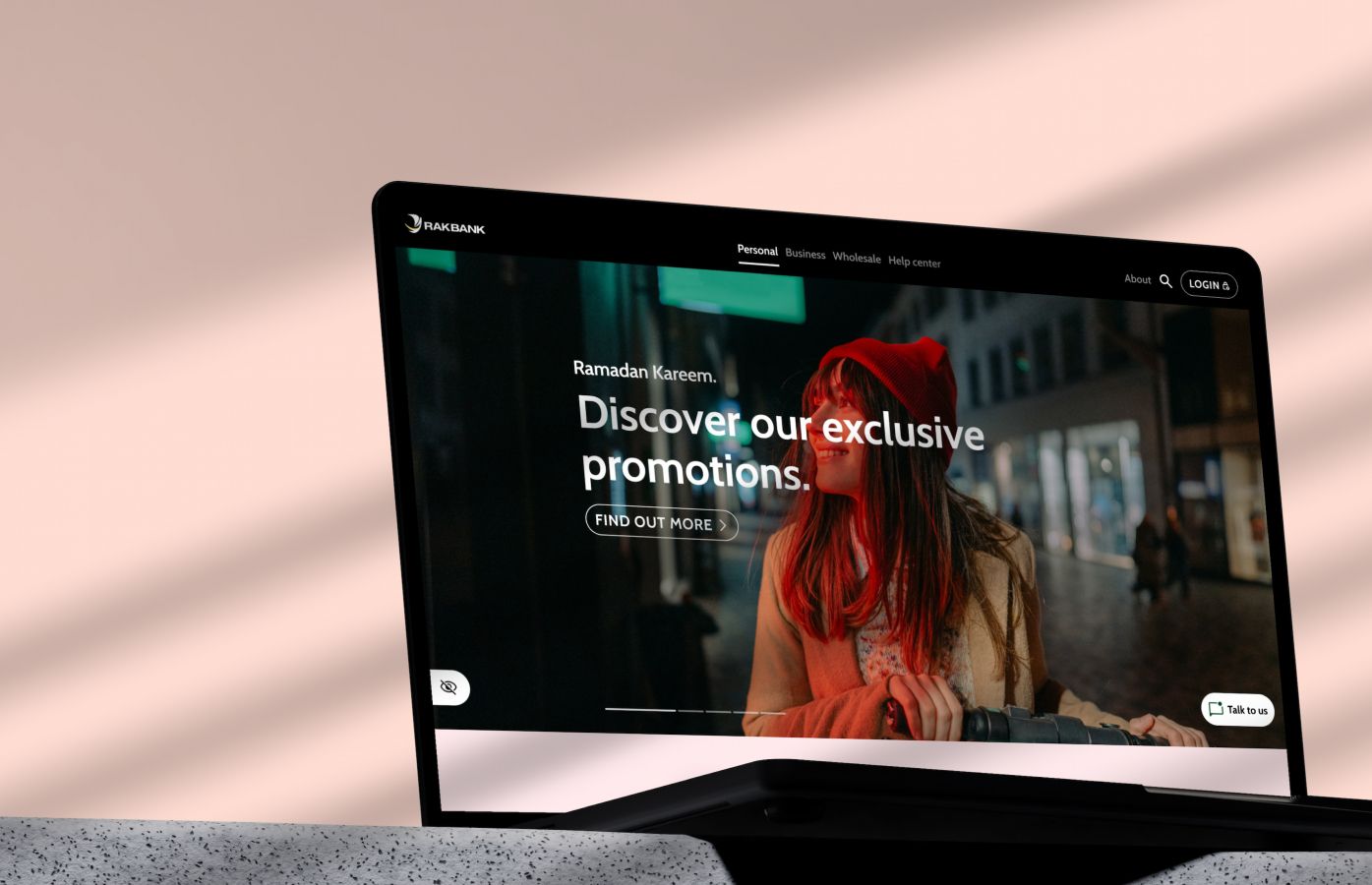
RAKBANK, a leading UAE bank, partnered with Gravitas to completely overhaul its outdated website, which had not been redesigned in over 10 years.
There is no nice way to say it… in the clients words..”our website is sh*t!”. A terrible user experience, with inconsistent branding, and a rigid structure that made digital marketing and acquisition unnecessarily challenging.
The goal of the project was to create a bold, user-centric website that not only appealed to a younger audience, reduced the cost to service and convert leads to customers.
Over a 5-month period, Gravitas used its Concept Design and Co-Creation Frameworks to deliver a new design identity, language, and modular design system across 2000+ pages, ensuring a seamless experience for both customers and internal stakeholders.
The problem statement
RAKBANK’s website had become seriously outdated, due to lack of investment over a 10 year period.
The Symptom
Dated design, hidden information, disconnected user experience, disconnected brand experience, legacy everything and ultimately an underperforming digital asset.
The Impact
The website was underperforming its peers by a factor of 10. Online conversions were low, call centre loads high and it positioned the brand as low end bank for a lower socioeconomic audience.
The Scope
Initially the scope was to develop a new design for the website, but the scope scaled to include the new design language for all digital channels and the starting point for a revitalised offline brand.
The Ask
Design a market leading website in line with the new brand ambition, modernise the user experience, uplift content, enhance lead capture and conversion rates.
Challenge 1: Uplifting the digital identity & optimising the CX.
How might we create a modern, user-friendly website that enhances the customer experience and reflects the bank’s evolving brand positioning?
Reality
A shocking user experience and a woeful brand experience that was a million miles from the banks ambition to attract affluent & young professional Gen Z and millennials.
Desired Outcomes
- Create a bold user-centric design language that differentiates itself from other banks.
- Enhanced brand recognition.
- Leapfrog competition to set a new benchmark.
- Increase conversion rates.
- 100% CPF compliance.
Solution
We employed the Gravitas Concept Design Framework to develop a new design identity that would scale across multiple segments, sub-brands (SME / ISLAMIC / CORPORATE), platforms and channels.
The team took inspiration from bold, non-traditional sectors like fashion and entertainment to craft a website that stood apart from typical banking sites.
What we did…
Simply, designed the best tier two bank website in the UAE.
- Problem definition.
- Experience strategy.
- Co-creation workshops.
- Ideation workshops.
- Benchmarking.
- Desktop & trend research.
- Customer Research & Testing.
- Concept Design.
- Brand digital guidelines.
Challenge 2: Inefficient Design Management and Lack of Scalability.
How might we design a modular, scalable design system & language that allows for easy adaptability & scalability while maintaining design consistency across all 2000+ pages?
Reality
The bank did not have a design system to allow it to maintain experience and design consistency across its digital channels nor derive efficiencies that a design systems create.
Desired Outcomes
- Reduce brief to go-live time.
- Minimise design and development debt.
- Consistent user experience across platforms.
- Catalogue of templates and components.
- Implement DesignOps and governance.
- Establish clear design rules and patterns.
Solution
We used the Gravitas Design Language Framework to develop a modular design system that scales across multiple segments, business divisions, sub-brands, platforms, languages and breakpoints.
Working with the team we were able to document a bespoke DesignOps and governance model to put the Design System into operation.
What we did…
- Current brand analysis.
- Stakeholder interviews.
- Desktop research & benchmarking.
- Requirements gap analysis.
- Design System Setup & Documentation (Atomic DesignOps).
- Governance Model.
- Front end code library.
- Storybook.JS Integration.
Results
The regions best designed website for a tier two bank!
#1
The new website quickly became a leader in the region, winning industry accolades.
90%
Reduction in design turnaround time, while development debt decreased by 95%, ensuring faster, easier updates across the site.
10pt
Increase in the Net Promoter Score (NPS).
Lead capture and conversion rates jumped by 6x due to optimised customer journeys.
5+
Channels now use the new design system, including mobile banking, web banking, and ATMs, ensuring consistency across all customer touch points.